






The Ultimate Guide To Choosing the Perfect Wall Colour Combination For Your Home
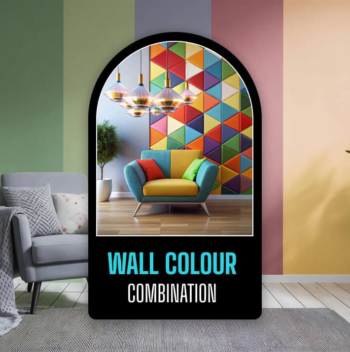
Messing around with home design is basically just a fun way to make your own personality show up in your living space.
Honestly, if you want to breathe new life into a boring room, the fastest trick is picking a new wall color combination.
Think of paint as a quick styling shortcut. A fresh coat can completely flip the energy of a room and genuinely help you shake off a stressful day the second you walk through the front door.
Lately, what people want in their homes has changed quite a bit. Most of us are stepping away from those heavy, moody colors that used to be everywhere.
Instead, everyone is leaning toward airy pastels and clean neutrals. They just make spaces feel brighter, bigger, and incredibly classic.
You can choose a modern wall colour combination that keeps your place looking up-to-date and cozy if you are getting ready to repaint a bedroom or give your whole house a fresh face.
Let’s look at some of the best ways to bring these shades to life in your rooms.
Quick Summary: Top Palettes At A Glance
If you are in a rush and just want a quick idea, here is a peek at the top designer-approved palettes trending right now. They look beautiful in almost any modern home:
| Room Type | Best Wall Colour Combination | Vibe Created |
|---|---|---|
| Bedroom / Rest | Sage Green + Warm Cream | Calm & Peaceful |
| Living Room | Dark Auburn + Cracked Pepper | Rich & Coziest |
| Study / Drawing | Blue Nova + Pearl Grey | Elegant & Quiet |
| All-Home Neutral | Taupe + Soft Khaki + Ivory | Clean & Minimalist |
How Wall Colours Change Your Mood
Picking a wall colour combination is about so much more than just finding a pretty swatch in a catalog.
The colors you surround yourself with actually change how you feel in your own home. When you get the palette right, the room just feels good to sit in.
How Colors Affect Your Day-To-Day
Our minds react to different hues in very specific ways. For example, light blue offers a huge sense of peace and helps lower daily stress.
Additionally, soft greens create a nice balance and help a tired mind rest. That’s why green is so popular in home offices and reading corners.
You also have to think about where you want high energy. Terracotta or deep red shades are great for sparking conversation.
This is what makes them perfect for dining spaces. Meanwhile, soft yellow adds instant cheer and brightness to dark hallways.
| Colour | How it helps | Best for |
|---|---|---|
| Blue | Calming & Tranquil | Relaxation spaces and bedrooms |
| Green | Refreshing & Balanced | Focus areas, reading nooks, and studios |
| Red / Terracotta | Energetic & Stimulating | Dining rooms and social zones |
| Yellow / Cream | Optimistic & Bright | Dark corners and narrow hallways |
The Trick To Pairing Shades Well
Creating a balanced room requires a little bit of planning. It’s all about how your paints sit next to each other.
Putting a deep, bold shade right next to a really light tone makes the room exciting, but if the contrast is too sharp, your eyes can actually get tired of it over time.
This is why you have to pay attention to the undertones in your paint. The room will look way better if your base shade and accent shade have similar undertones.
For instance, if you pick a creamy white with a warm, sunny vibe, your second paint choice should also be warm—like a soft beige or a gentle clay—rather than a cold, icy grey.
How Light Changes Everything
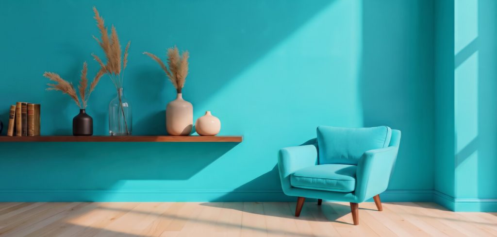
Your chosen wall colour combination will look totally different in the morning than it does at night.
A paint that looks warm and inviting at noon might look kind of chilly once the evening sets in. This happens because the light hitting your walls is always shifting.
Watching Natural Light Shift
The direction your windows face pretty much dictates how your wall paint will behave:
- North-Facing Rooms
These spaces get a cooler, slightly blue light all day. If you use a stark white or a cool grey here, the room can feel pretty empty and cold.
Moreover, you can fix this by balancing it with a warm paint mix like soft ivory, warm sand, or gentle peach.
- South-Facing Rooms
These rooms get hit with intense, warm, direct sunshine. They handle almost any paint well.
However, you can also find some cool options like muted blues or crisp sage greens. This helps keep the space feeling fresh and breezy on hot days.
- East-Facing Rooms
You get bright, golden sunlight in the morning, which slowly turns into cooler, soft shadows by the afternoon.
- West-Facing Rooms
These spaces can look a bit dull early in the day, but they glow with a beautiful, rich orange-amber warmth during the evening sunset.
Switching On The Lights At Night
Once night falls, your indoor light bulbs take over the visual design of your home:
- Traditional Yellow Bulbs (Incandescent)
These lights make everything look much warmer. They make your reds, oranges, and yellows pop, but they can make blues and greens look a bit muddy.
- Cool Fluorescent Tubes
These create flat, icy tones. They can wash out warm paint choices or give them a strange, slightly green tint.
- Modern LED Bulbs
These bulbs give you full control. You can choose Warm White (2700K) to bring back that cozy, yellow evening glow, or Daylight (5000K).
This can help you to keep your paint combinations looking crisp, clean, and exactly like they do under the afternoon sun.
What Are The Popular Colour Trends?
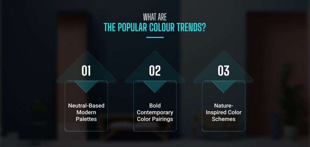
The newest trends for home palettes merge classic style with a refreshing, contemporary twist.
Major paint brands and design experts are now focusing their forecasts on soothing, nature-inspired, and highly comfortable tones.
Let’s break down the three biggest style movements shaping homes today.
· Neutral-Based Modern Palettes
Contemporary homes truly shine when using sophisticated, elevated neutral pairings.
A deep red-brown shade like Dark Auburn works wonders, adding immense depth to any main living area.
It blends beautifully with softened blacks like Cracked Pepper, giving you a very sleek look that still feels warm and welcoming.
If you prefer a lighter, brighter approach, try painting your walls a cozy greige.
From there, layer the room with soft ivory fabrics, rich tan leather, and dark metal furniture.
This approach creates a high-end, designer look without making your room feel crowded.
· Bold Contemporary Color Pairings
Today’s trending home layouts are all about making a tasteful, memorable statement.
If you want a luxurious feel, look for deep blues that feature subtle violet undertones, like Blue Nova.
Pairing this type of blue with a gentle pearl grey creates a stunning look that feels upscale yet incredibly peaceful.
On the other hand, if you want a cheerful, bold look, lighter options like Peach Fuzz offer a softer statement that brings calm and freshness to your space.
It brings a clean, sunny energy to your walls, especially when paired with crisp white trim around the doors and windows.
· Nature-Inspired Color Schemes
You can also gather inspiration directly from the great outdoors.
The popular organic modern style uses deep slate blacks contrasted against soft whites. You can use forest greens, muted sages, and soft sky blues to add wonderful depth.
This design trick effortlessly links your indoor rooms with outdoor nature, keeping your home modern while grounding it in a peaceful environment.
How To Implement Your Paint Ideas?
An amazing room layout requires more than just picking a pretty shade from a design catalog.
You need to test and apply your paints correctly to achieve long-term styling success.
Here is a simple guide to help your chosen palette blend perfectly into your home.
Testing Colors In Your Space
You must always apply paint samples directly onto your actual walls instead of painting loose pieces of cardboard.
Consider putting a 1′ x 1′ sample patch on a few different walls. This is a lifesaver because colors shift dramatically depending on the light.
Also, make sure to apply two full coats to get an accurate look at the shade. So, check on these paint patches at different times of the day.
It is smartest to test them on bright walls right next to windows and on dim walls in dark corners.
This lets you see exactly how your chosen colors will transform from morning to night.
| Testing Method | Minimum Size | Number of Coats | Location Tip |
|---|---|---|---|
| Direct Wall | 1′ x 1′ | 2 Coats | Near windows and dark corners |
| Bright Colors | 1′ x 1′ | 2 Coats + Primer | On the main accent wall |
Coordinating With Existing Furniture
Your new paint shades must complement the furniture you already own, unless you plan to replace everything.
Use your favorite item, like a rich tan leather sofa or a deep walnut coffee table as your design anchor.
Your wall colors should ideally be a few shades lighter or darker than that main piece to build a beautiful sense of layers in the room.
Master The 60-30-10 Design Rule
Professional decorators rely on a simple percentage trick to make sure your wall color combination does not overwhelm the space.
This can help you to keep any room looking visually balanced and easy on the eyes:
· 60% Dominant Color
This is your main backdrop. It covers the majority of your walls and establishes the overall mood. It is usually a soft neutral, a light cream, or a pale pastel.
· 30% Secondary Color
This shade creates structure. Use it on a single feature wall, your doors, the window trim, or large furniture pieces like your sofa or built-in bookshelves.
· 10% Accent Color
This is your pop of pure fun! Use it in tiny doses through items like throw cushions, artwork, fresh flowers, lampshades, and small tabletop decor.
Creating Accent Walls And Focal Points
A well-placed accent wall can change how large or small your room feels. The wall you naturally look at first when walking into a room is almost always the best choice for an accent. You can make this feature stand out using a few clever methods:
- Firstly, you can use built-in shelving or architectural pillars to create clean, natural borders for your accent paint.
- Second, introduce subtle textures, like a soft matte paint finish or a patterned wallpaper border, to catch the eye.
- After that, set up smart lighting, like warm track lights or adjustable spotlights, to make your feature wall glow.
- Lastly, scatter small accessories in that same accent color throughout the rest of the room to tie the whole look together and maintain a sweet visual balance.
How To Maintain Your Space?
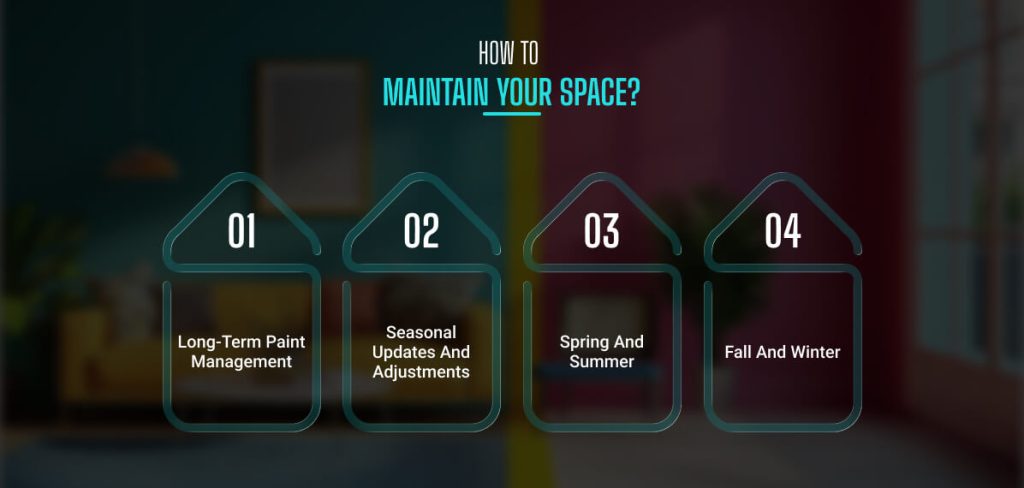
Finishing your paint job is just the first step of your interior journey. You can easily keep your home spotless and vibrant all year long.
With proper wall care, you can make it even smarter with easy updates as time goes by.
Long-Term Paint Management
Always buy the right finishes for high-traffic zones like hallways and living areas to keep your walls looking freshly painted.
You can opt for wipeable matte, eggshell, or satin finishes.
These smart formulas allow you to gently wipe away dirt, smudges, and fingerprints.
You can use a damp microfiber cloth without ruining the paint or leaving awkward shiny spots.
Also, save a little bit of leftover paint in a small, airtight jar for quick, seamless brush touch-ups later on.
Seasonal Updates And Adjustments
Your rooms can easily adapt to different times of the year through simple decor swaps, keeping your home feeling cozy and updated.
Changing up your textiles is a fantastic way to give your paint colors brand-new depth as the weather shifts.
· Spring And Summer
Swap out heavy, dark drapes for breezy, sheer white linen curtains. Bring in light pink, sage green, or soft yellow pillows alongside woven jute rugs and fresh greenery to make the space feel bright and airy.
· Fall And Winter
The cooler months call for rich, heavy textures. Bring out thick wool blankets and velvet cushion covers in dark auburn or burnt orange. Moreover, warm brass or copper metallic decor accents can make your home feel like a warm, relaxing sanctuary.


Leave A Reply